|
The fundamental feature of electronic forms is that they contain interactive components for entering data. Information is entered not just by typing text, but also by selecting menu items, or checking boxes.
This section describes the standard set of form components and when they are typically used. We will also see how to create the components using HTML.
The primary HTML element used for creating forms is, appropriately, the form element. An example can be seen on lines 11 and 12in Figure 5.3. This element does not display anything in a browser, but it provides a container for all other form elements.
The form element dictates how and where the information that is entered into the form gets submitted. The important attributes that control these aspects of a form are discussed later in Section 5.5.
All other form components are described by elements nested within the form element and will be addressed in the appropriate section below.
Radio buttons allow a single response to be chosen from a fixed set of valid responses. The advantage of this sort of component is that it restricts the input to only valid responses.
Radio buttons can be used to enter data for a categorical variable. A single variable, e.g., gender, requires a group of radio buttons, with one radio button for each possible value of the categorical variable, e.g., one button for male and one button for female.
Radio buttons are not appropriate when the list of possible responses is long, such as when selecting a year of birth. In cases like this, a menu or drop-down list is more appropriate (see Section 5.6).
An example of the use of radio buttons in the I-94W form is shown in Figure 5.4. The typical display of a radio button is a small circle, with a dot drawn within the circle to show that the radio button has been selected.
In HTML, radio buttons are generated by input elements. The code used to produce one of the radio buttons in Figure 5.4 is shown below:
<input type="radio" name="country" value="1" />
The input element can be used to produce several different form components via the type attribute. In this case, a radio button is produced by specifying type="radio".
The other important attributes are name and value. The value specifies what data value will be recorded if this radio button is selected (selecting this radio button will record the value 1). The value can be any text so, for example, an alternative would be to specify value="Andorra" because this radio button correponds to the Andorra option on the form. That would make it easier to know what this radio button is for, but would be less efficient in terms of storing the information (see Chapter 7 for more discussions of these issues).
The name attribute provides a label for the information that is to be stored. It corresponds to the name of a variable in a data set. The important thing to remember when creating radio buttons in an HTML form is that all radio buttons within the same set of answers must have the same name attribute. This is necessary so that only one of the radio can be selected at once, which is the characteristic behaviour of radio buttons. For example, the code below shows the HTML behind another of the radio buttons from the same question in Figure 5.4:
<input type="radio" name="country" value="2">
The value for this radio button is 2 (which corresponds to an answer of Iceland), but the name is country, which is the same as for the other radio button. This means that only one of these two radio buttons can be selected at once.
Only one value will be stored from a group of radio buttons so it is important that the value attributes are all different for all radio buttons with the same name.
It is important to note that each input element only produces a little round radio button on the web page. All of the text labels are produced by plain text within the web page and it is up to the page designer to make sure that the text for questions and the text for answers is appropriately arranged relative to the form components. We will discuss this further in Section 5.3.8.
For radio buttons, the input element has a checked attribute that can be used to make one of the radio buttons within a group selected by default when the form is first displayed.
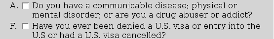
Check boxes allow zero or more responses to be chosen from a fixed set of options. The difference between check boxes and radio buttons is that, with check boxes, it is valid to select none of the options and it is valid to select more than one option at the same time.
Check boxes can be used to enter data for yes/no questions. Each check box corresponds to a different variable.
An example of the use of check boxes in the I-94W electronic form is shown in Figure 5.4. The typical display of check boxes is a square, with a tick or a cross within the square to indicate that the check box has been selected.
In HTML, check boxes are another variation of the input element, this time with type="checkbox". The code below shows the HTML behind the two check boxes in Figure 5.4:
<input type="checkbox" name="ill">

<input type="checkbox" name="visa">
The value attribute is less important with check box components because there are only two possible values for a check box: selected or unselected. What is more important is the component name, which corresponds to the name of the variable that is being recorded. Every check box in an electronic form should have a unique name.
Like for radio buttons, the input element for check boxes has a checked attribute that can be used to make any checkbox selected by default when the form is first displayed.
Text fields allow open-ended responses. It is much harder to constrain text input to valid values--for example, it may be hard to ensure that a telephone number has the correct format--but if the set of possible answers is unknown or infinite, for example, when asking for a person's name, then this sort of form component is the only option. Sophisticated validation of text responses can still be done, but it requires other knowledge (see Section 5.4 and Section 11.9.3).
A text field usually corresponds to data entry for a single variable.
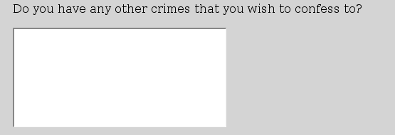
Common uses of text fields are to allow the respondent to expand upon a previous response to a question and to allow open-ended feedback at the end of a survey. Examples of these uses of text fields are shown in Figure 5.5.
|
In HTML, there are two types of text form component, one for entering small amounts of text (a single word or expression) and one for entering large amounts of text. The code below shows the HTML behind the first small text field in Figure 5.5. This is another variation on the input element.
<input type="text" name="when" size=10>
Again, the name attribute is the most important so that different text input components within a form can be distinguished from each other. The information that is recorded for this form component is whatever the user types into the text field. The value attribute just provides default text (i.e., this is what is shown when the form is first viewed).
This type of input element also allows a maxlength attribute, which can be used to limit the number of characters that the user can type into the field. There is also a size attribute to control how wide the text field appears on screen (as a number of characters of text).
For large blocks of text, there is a separate, textarea, element. The HTML code for the large text field in Figure 5.5 is shown below:
<textarea name="confession" rows="8" cols="40">
</textarea>
The rows and cols attributes of this element are used to control how many rows and columns of text are displayed on screen (i.e., how big the text field is on screen). The content of the element is used as default text when the form is first displayed. Care should be taken with this content because all white space is preserved, so any spaces or new lines show up in the default text. In the example, the default is to show a blank text field.
A menu or drop-down list allows a single response to be chosen from a fixed set of options. This type of form component is very similar to a radio button, but, because a menu generally takes up less space on screen, it is more appropriate when the list of available options is large.
Menus can be used to record data for a single variable.
The I-94W question on country of citizenship (shown in Figure 5.2) could be presented as a menu. A possible menu presentation for this question is shown in Figure 5.6.

|
In HTML, a menu is created using a select element for the overall menu with option elements inside to specify the individual menu options. The HTML code for the menu in Figure 5.6 is shown below:
<select name="country">
    <option>Andorra</option>
    <option>Iceland</option>
    <option>Norway</option>
    <option>Germany</option>
    <option>New Zealand</option>
    <option>United Kingdom</option>
</select>
Some of the code has been left out, but the pattern should be clear.
The value that is recorded from the menu component is the value of the option element that is selected by the user. By default, the value of an option element is the content of the element, but there is a value attribute to allow a different value to be specified. For example, in the following code, the value of the element would be NZL not New Zealand:
<option value="NZL">New Zealand</option>
The option element also has a selected attribute that can be used to set the default menu option when the form is first displayed.
A slider allows a response along a continuous or fine-grained scale. The response is constrained by minimum and maximum values, but remains free within that range.
A slider is often used to enter data for a rating variable. Figure 5.7 shows an example of a slider input element.

|
Unfortunately, HTML has no form element corresponding to a slider component. Section 5.4.2 describes some alternative technologies that could be considered if this type of form component is important to a survey.
A very important component in any form is the button at the bottom that lets the user submit the information that has been entered.
In HTML, a submit button can be produced either using a button element or as yet another variation on the input element. The following code shows the HTML behind the submit button on the I-94W form in Figure 5.2:
<input type="submit" value="submit">
The value attribute can be used to specify the text that is displayed on the button. The next piece of code is equivalent, but uses a button element instead:
<button value="submit" name="submit" type="submit">
What happens when the submit button is clicked will be discussed further in Section 5.5.
As mentioned in Section 5.3.2, the arrangement of text labels relative to the actual form components is entirely the responsibility of the designer of the form. Care must be taken to make sure that the text label beside, say, a radio button corresponds to the value that is recorded for the radio button.
For example, the following HTML code is perfectly valid syntax, but it is semantically-challenged:
Select your gender:
  male <input type="radio" name="gender" value="female">
female <input type="radio" name="gender" value="male">
It is possible to use a label element within an HTML form to explicitly relate a piece of text to a form component, but even then the semantic content of the text is still the responsibility of the form author.
One advantage of using the label element is that it can provide assistance for using a form with non-graphical browsers and it can enhance the behaviour of the components in on-screen interactions. For example, if a label element is used to relate a text label with a check box or radio button, then a click on the text will select the check box or radio button.
A label element is related to a form component either by placing the form component within the label element, or by using the for attribute of the label element. The code below shows a label element being used to relate the text label to the first radio button in Figure 5.4:
<input type="radio" name="country" value="1"
       id="COUNTRY01">
<label for="COUNTRY01">
    Andorra
</label>
The value of the for attribute of the label element refers to the value of the id attribute of the radio button element. The following code is equivalent, but uses the approach of embedding the radio button element within the label element:
<label>
    <input type="radio" name="country" value="1" />
    Andorra
</label>
The use of label elements is also an example of good documentation technique. Even if there is no effect in terms of the behaviour of the form, there is a gain in terms of the clarity and maintainability of the underlying code.
Paul Murrell

This document is licensed under a Creative Commons Attribution-Noncommercial-Share Alike 3.0 License.